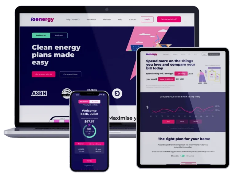
A start up electricity provider spotlighting clean and green energy
Overview
Challenge
As a part of a client project, my team of 20 co-designers and I were tasked with improving the onboarding experience, reducing as much friction as possible, in an attempt to entice new customers to sign up.
iO energy is a start up energy provider that is based in Adelaide with huge potential. With their emphasis on delivery clean energy at affordable prices, their motivation only needed to be translated to the user experience of the onboarding process.
To identify these areas of improvement and the friction mentioned, we conducted a preliminary desktop research. Which included desktop research, competitor analysis and a heuristic evaluation of their existing onboarding experience. Some initial key insights we used to help us create our initial problem statements were:
Inconsistencies with the onboarding, where the sign up would take you to another company page
Complicated presentation of plan breakdowns, attributed to the lack of information breakdown
What's the problem?
Although onboarding is similar for both residents and businesses, they both have different perspective when it came to researching and understanding energy.
Residents
Australians are not incentivised enough to understand their current electrical bill(s), what type of competitive offers are available and are unsure where to check to see if their energy is renewable and if it benefits them cost-wise.
Businesses
Australian businesses are hesitant to sign up to iO Energy because they are confused by how the cost benefits them and the information on renewable energy is unclear.
The Research
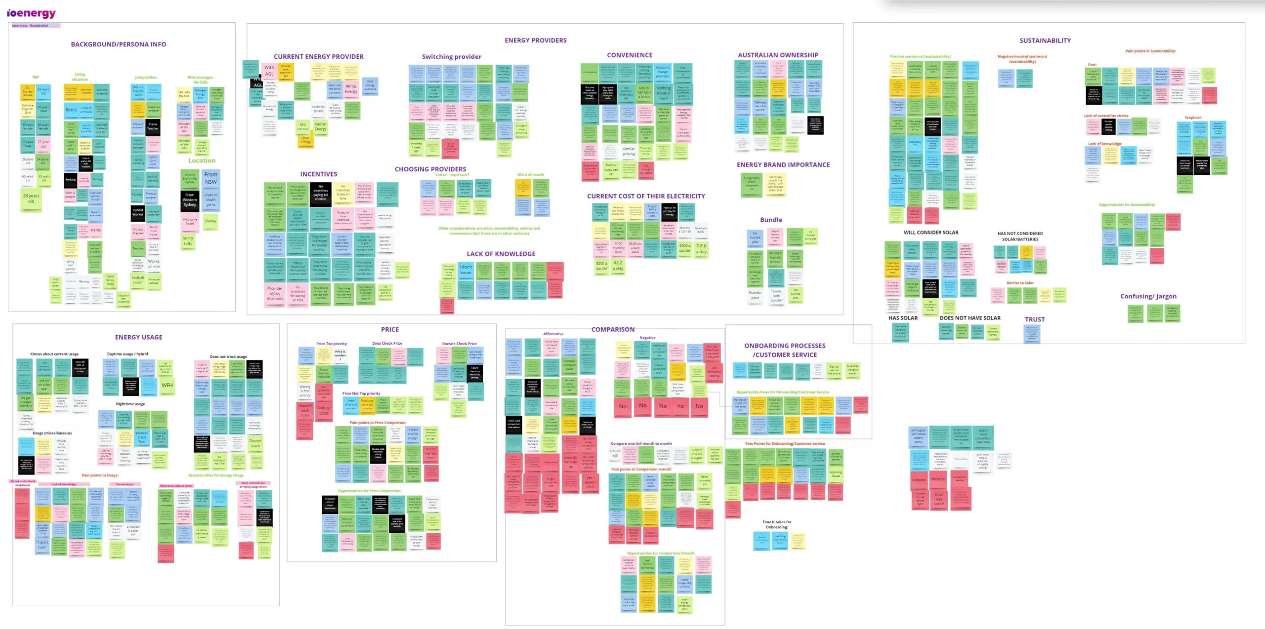
To eliminate any personal bias attached to the problem statements, we conducted further research through surveys and one on one interviews. We sent out two separate surveys for residential and business users, with questions gauging their interest and methods when it came to their selection of energy companies. But more importantly, their understanding of green energy. A qualitative response to these questions were obtained through our one on one interviews, with both parties of users.
Survey Results
45 Residential Surveys
8 Business Surveys
Consume the majority of their energy between 3 PM – 1 AM
Don’t use any energy-saving practices in their business
Rent the property they are living in
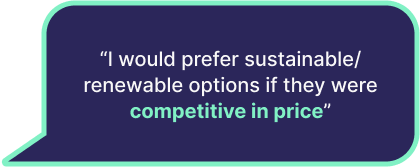
Find comparing energy prices to be very important when chosing a energy provider
Use a mobile device when researching about energy
List ‘Price’ as their main motivation to choose an energy company
Interview Results
18 Residential 1:1 Interviews
9 Business 1:1 Interviews
Insights
Residential Key Insights
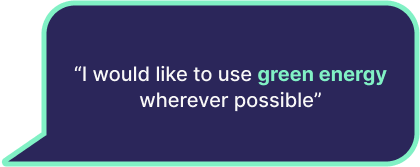
Have an interest in clean energy
Price is their top priority
Utilises price comparison tools
Don’t track or have knowledge about usage
Business Key Insights
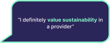
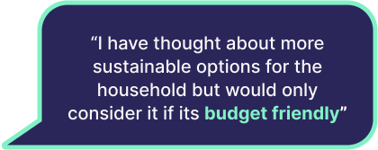
Have an interest in sustainability
Cost is important
Tracks their usage and would like to reduce it
Trust is a priority
The Pivot
With the additional insights gained through our research, our initial problem statement became outdated. So we reframed the two problem statement to reflect our new findings:
Residents
Australians lack motivation to find out where their power comes from and are unsure where to check to see if their energy is renewable and if it benefits them cost-wise.
Businesses
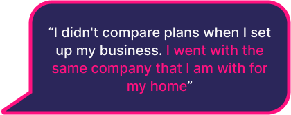
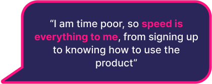
Australian Businesses are struggling to sign up to another competitive provider because they are time poor with understanding what deal is best and the information on renewable energy is unclear
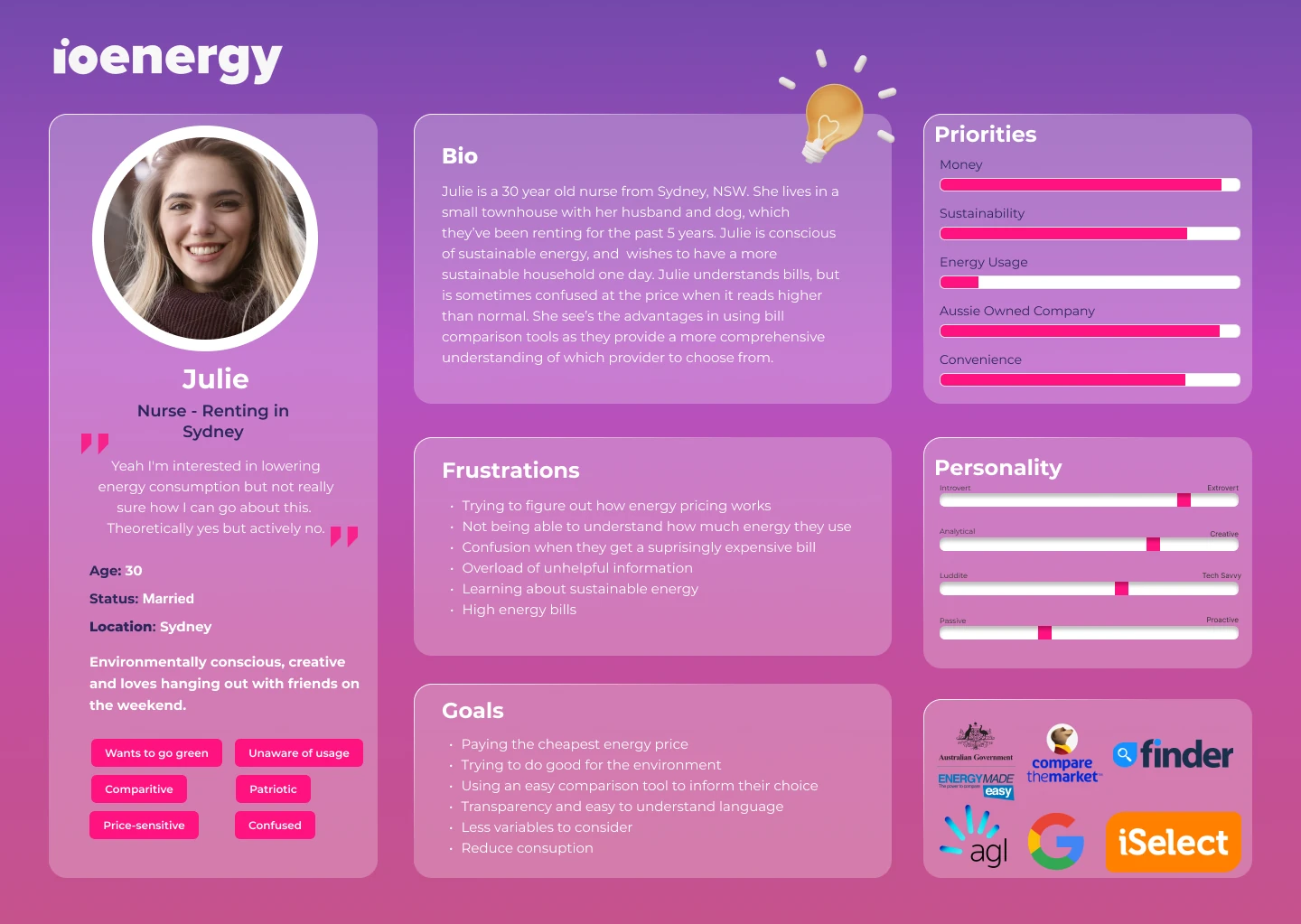
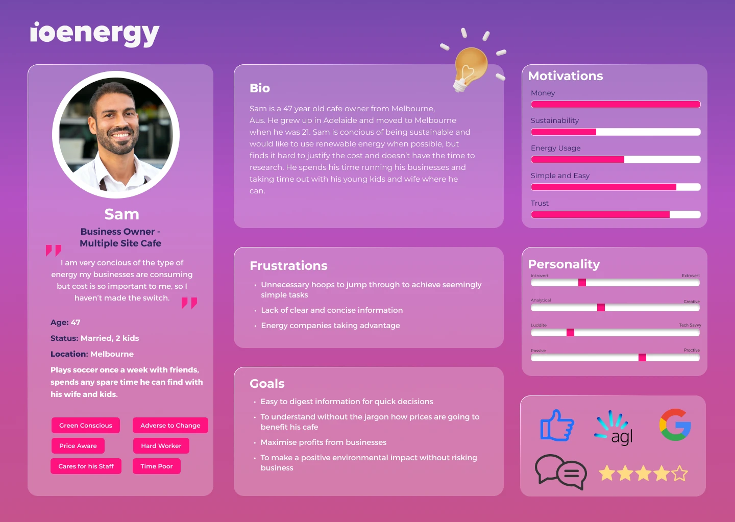
The Personas
These insights and data produced two individuals, Julie and Sam. Julie encompasses the residential users, who are looking to make a switch but have trouble dissecting the information given from energy companies. Sam represents the business owners, who are comfortable with their current providers, but when they’re open to switching companies, they don’t have the time or knowledge to comprehend the electric company jargon.
02 Define
Customer Journey Maps
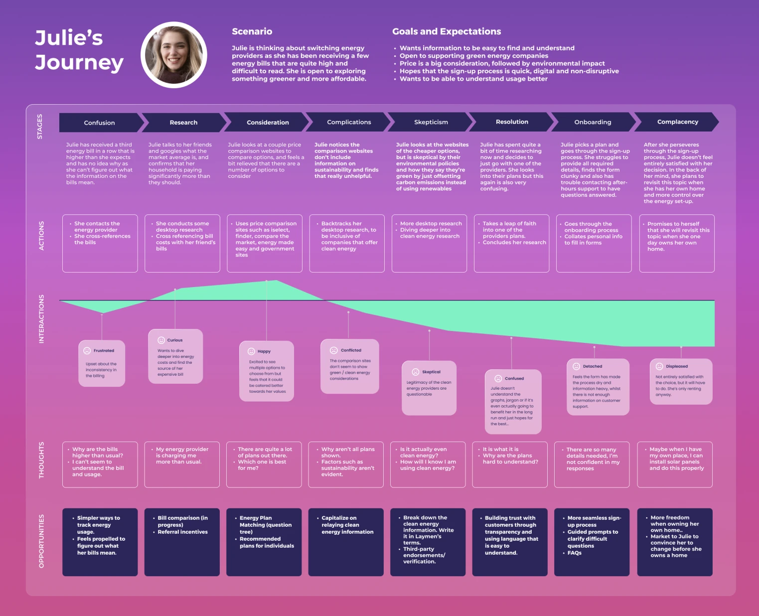
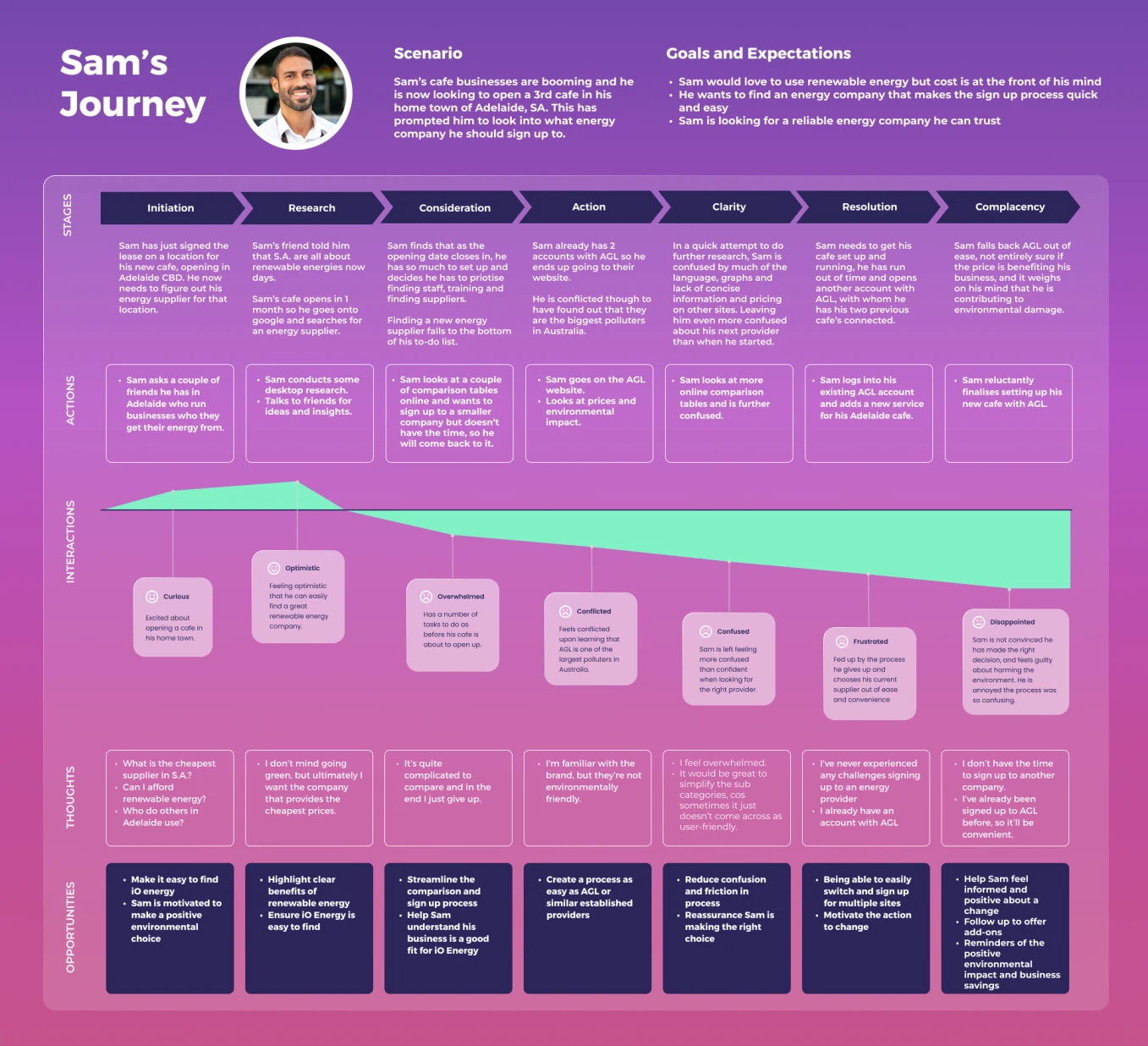
Both Julie and Sam’s journey illustrate a similar scenario, where in an attempt to research more about electrical providers and green energy, they are confronted by confusing graphs and jargon. Having difficulties consolidating the information, they end up giving up or go with a provider they are apprehensive about.
Residential Journey Map
Business Journey Map
Workshop & How Might We
Now that we have an understanding of Julie and Sam’s pain points, we created these sets of how might we statements that we think best assists in guiding towards a solution during our ideation workshops:
Julie’s How Might We Statements
Sam’s How Might We Statements
How might we build trust in iO energy for Julie by enhancing her understanding of renewables and the potential savings available?
How might we make the end-to-end sign up process seamless to build Julie’s confidence so that she feels she has made the right decision?
How might we educate Sam about the trustworthiness of a small business so that he is willing to make the change from a larger provider?
How might we make it easy and clear for Sam to understand the benefits and costs associated with switching to a greener energy provider, so that he is happy with the ease of the process?
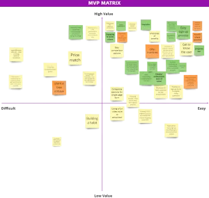
Residential MVP matrix
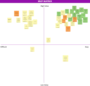
Business MVP matrix
Solutions
Some of the top ideas that we extracted from the mvp matrix were mainly to do with expanding upon site content that required more information, but also simplifying them to make the information easier to digest. Price and sustainability were key points that are covered by iO energy, just not articulated well enough. Moving forward our objectives are:
Website uplift to create consistency throughout the site, and let Julies and Sams navigate to where they need on the site to access relevant information (quiz) that will encourage them to sign up
Sign up process will be simplified by having it contained within the site as opposed to an external site. Additional information will be attached to the process to alleviate any confusions that could lead to lost sign up half way
Bill comparison uplift will help streamline the process and help Julies and Sams see value in the tool
Mobile companion was added as a bonus, as iO energy wanted to see the opportunities that it could present
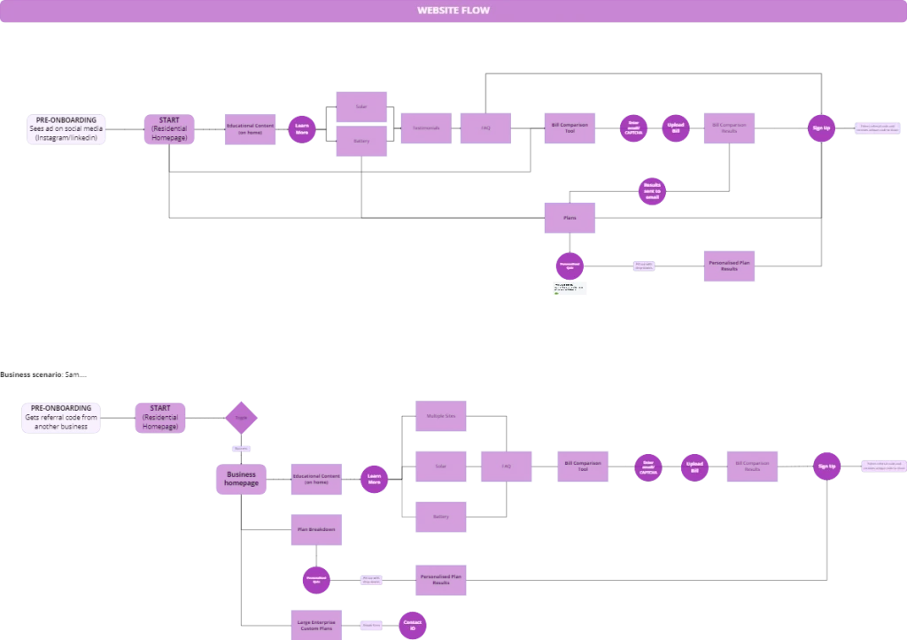
User Flows
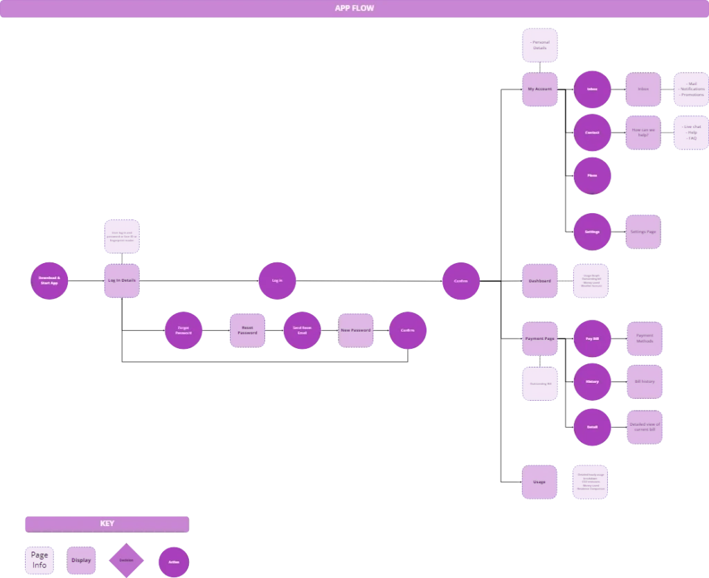
I was responsible for leading the mobile user flow. We initially had a sign up process mapped out, but upon quick research, found out that electrical plans were too complicated to be signed up on mobile.
App Flow
Website Flow
03 Develop
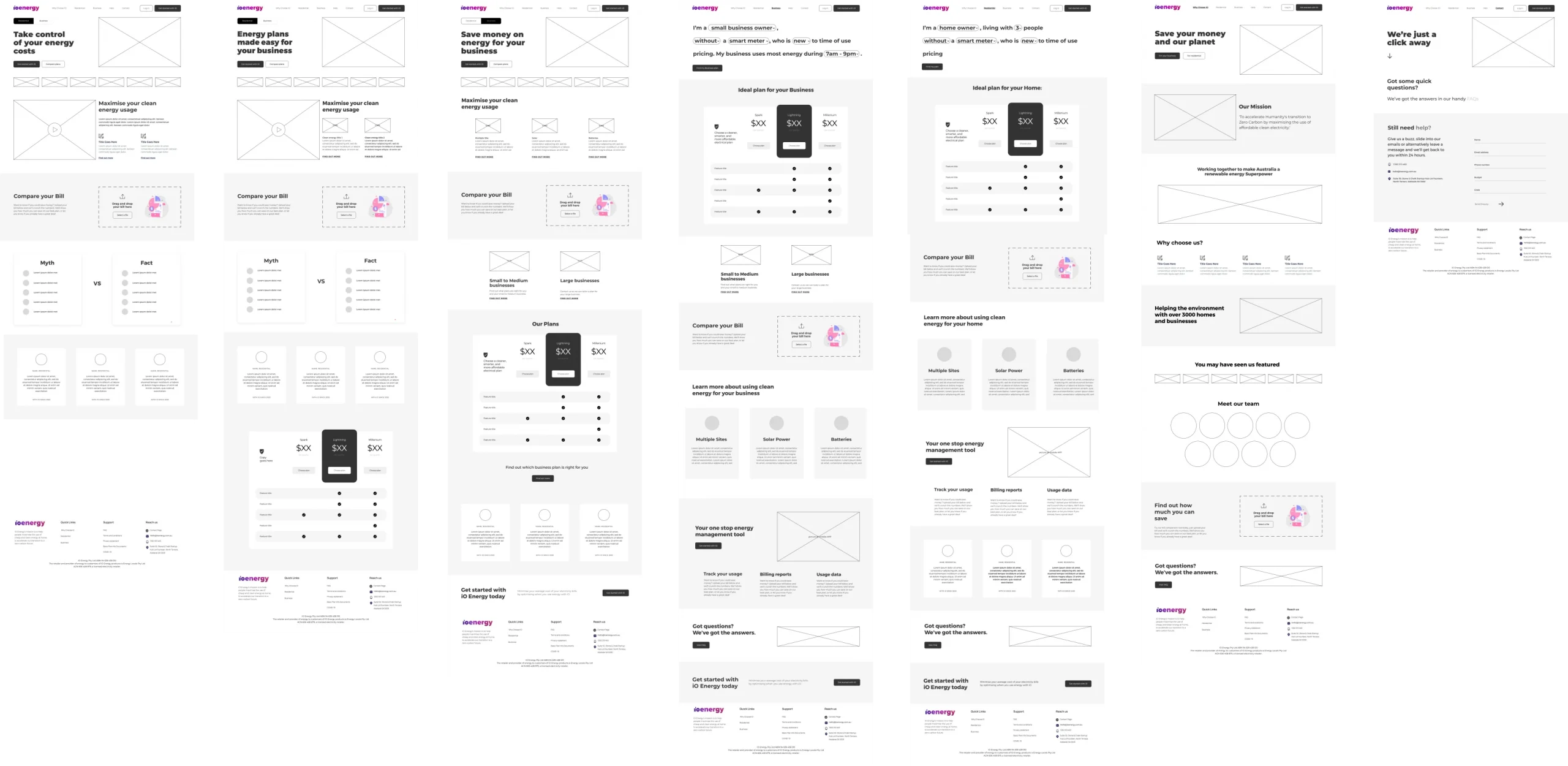
Website Wireframing
iO Energy already had a pretty fresh site, it was just the matter of giving it an uplift where needed, without deviating from the style guide. We took 4 points from our MVP matrix to keep in mind when wireframing the site:
Adding more call to actions through out the website and encourage Sam and Julie to use the bill comparison tool.
Making it easier for Sam and Julie to determine which plan works for their home/business.
Showing clear differences between iO’s Energy Plans
Showing the location of the growing iO community
Website User Testing
8 Julies Tested the Lo-Fi
7 Julies Tested the Hi-Fi
Ease of Use Score
Ease of Use Score
Lacked understanding / was confused about energy terminology
Found it easy to find information and sign up
Want to know more about iO Energy.
Specifically mentioned the quiz feature
“Easy to get the start of the sign up stage. Not complicated to get there”
“I want to know what sets iO apart as a company”
“It feels tailored to me when finding the right plan”
“Process to find information was easy. Got to the point. Easy to navigate”
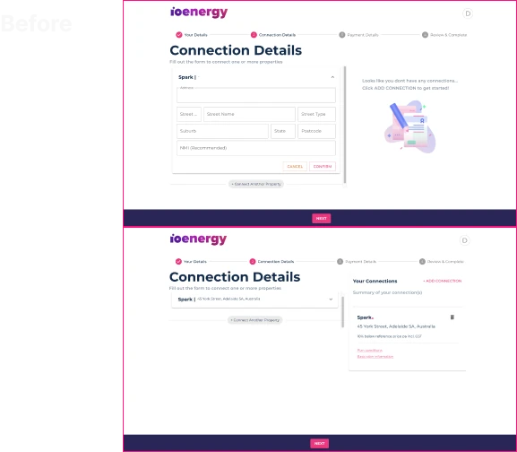
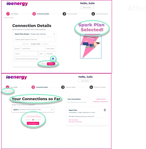
Sign Up Uplift
We worked on reducing the friction in the sign up process, which initially had the user transferred to an alternate site to complete the process. Working with iO’s CTO, we were able to have access to the updated version their team was working on.
Sign Up User Testing
7 Julies Tested the Original
9 Julies Tested the Uplift
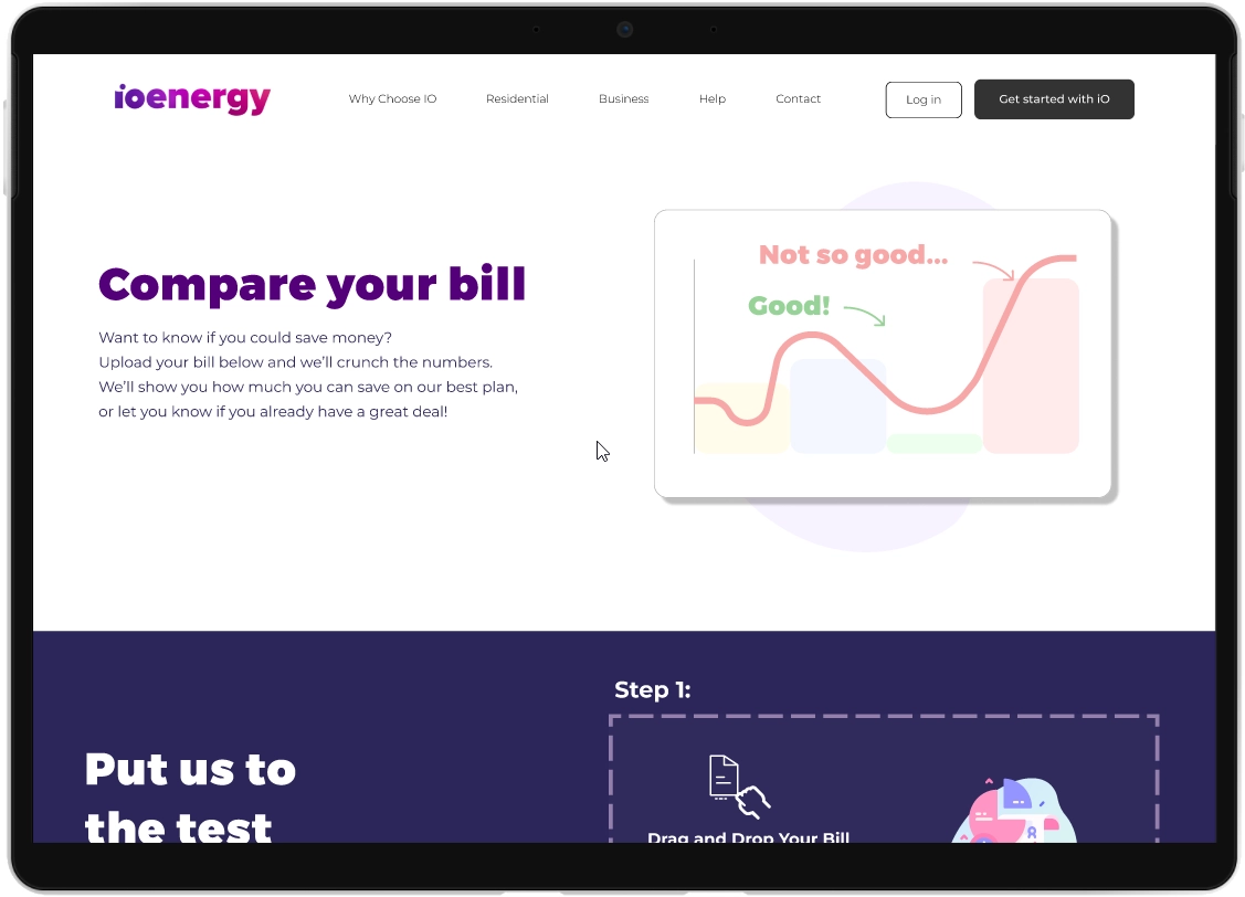
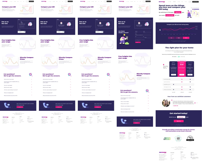
Bill Comparison Tool Uplift
We looked into other existing bill comparison tools to draw refence from in order to give Julies a streamlined experience. We wanted them to be able to achieve an end to end flow. From uploading their bill to getting their generated report, and providing them with all the information they need to make an informed decision.
Bill Comparison Tool User Testing
7 Julies Tested the OG
9 Julies Tested the Uplift
6.65
6.65
8.82
8.72
Ease of use of the Original Flow
Desirability of the Uplifted Flow
Ease of use of the Uplifted Flow
Desirability of Uplifted Flow
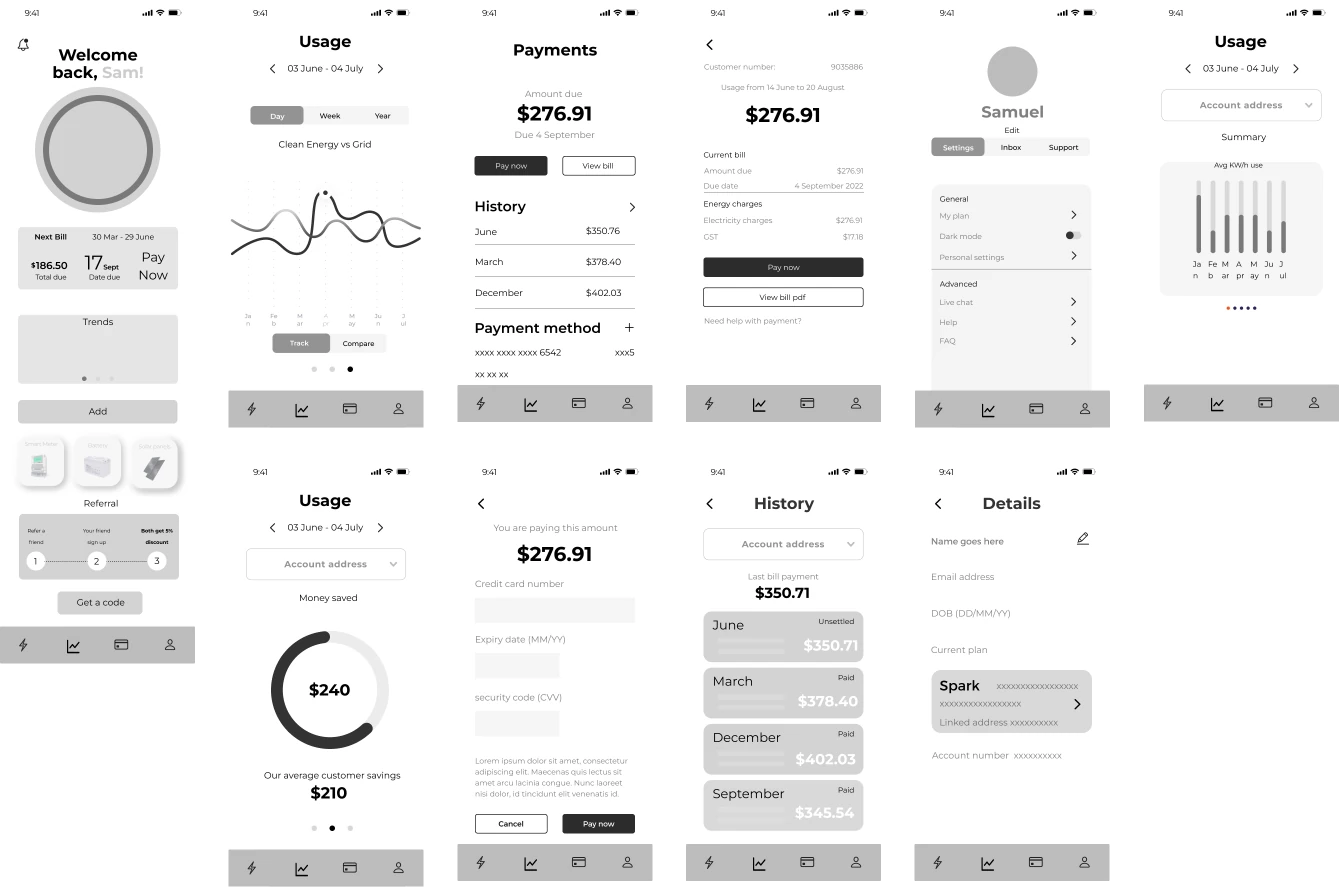
Mobile Companion App
As a companion app, we explored how we could incentivise Julies and Sams through app usage. It was an opportunity for us to tackle areas of oppotunities that the website couldn’t or was exclusive to the mobile platform.
Mobile Companion App User Testing
7 Julies Tested the Lo-Fi
8 Julies Tested the Hi-Fi
Ease of Use Score
Ease of Use Score
Felt as though iconography and other areas of information were misleading
Said they found the app simple and straight forward to use
Stated there were still additional features they’d like to see
Still said several parts of the app was misleading
“Simple and straight forward“
“I want to be able to toggle and view different properties’ usage and bills“
“Like seeing the breakdown from month to daily to hourly to see my optimal spending times. “
“I like how it gives you freedom to go through all the necessary information in a very easy way“
04 Prototype
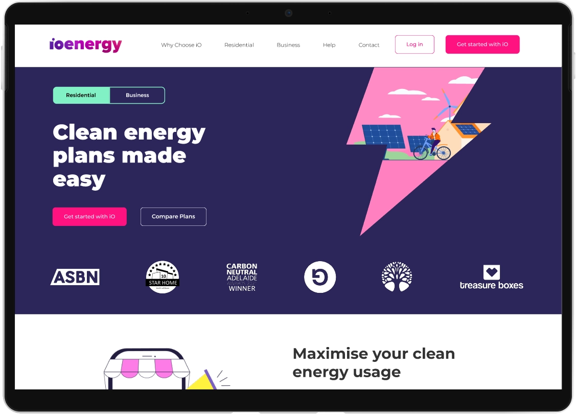
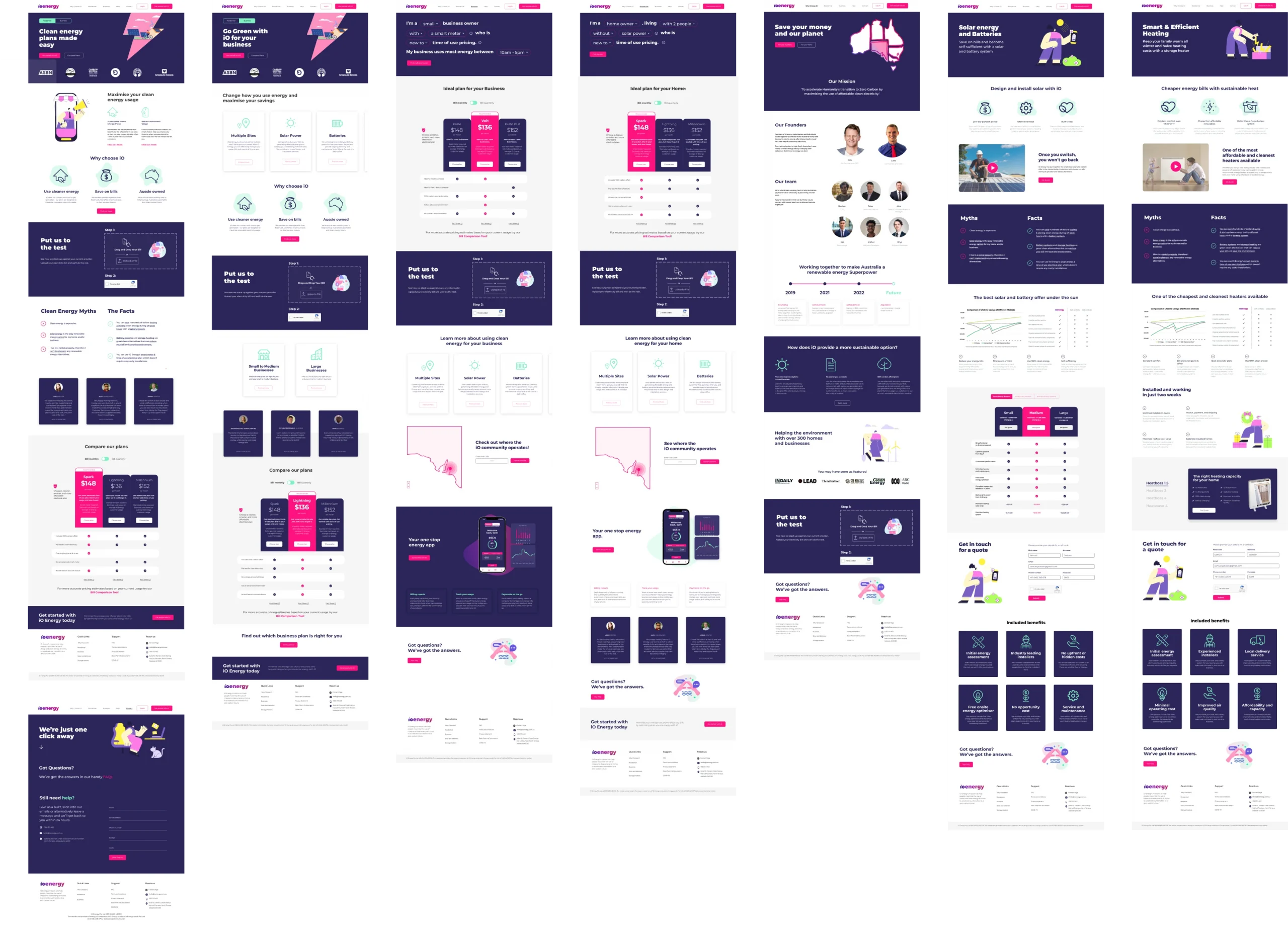
Website
Key Outcomes
Information relevant to the user can be toggled through the residential/business owner switch, making it easier for customers to navigate to the information they want
Information architecture was optimized, easy the navigation from point A to B
Pricing features were added to breakdown the information, bridging the confusion between the plans and customers
Consistency visually and functionally were applied to reduce any friction experience by customers browsing
Bill Comparison
Key Outcomes
Visual cues were added to address the confusion some customers had at points of using the tool
Convenience through the addition of auto filling functionality and filtering out any unnecessary required information. Preventing possibility of turn overs mid way through using the tool
Comparison graph of customer’s current plan vs iO’s plan, makes it easier to understand the savings
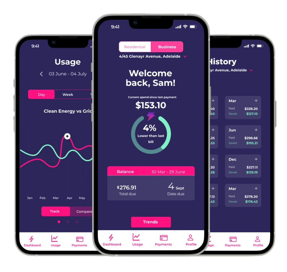
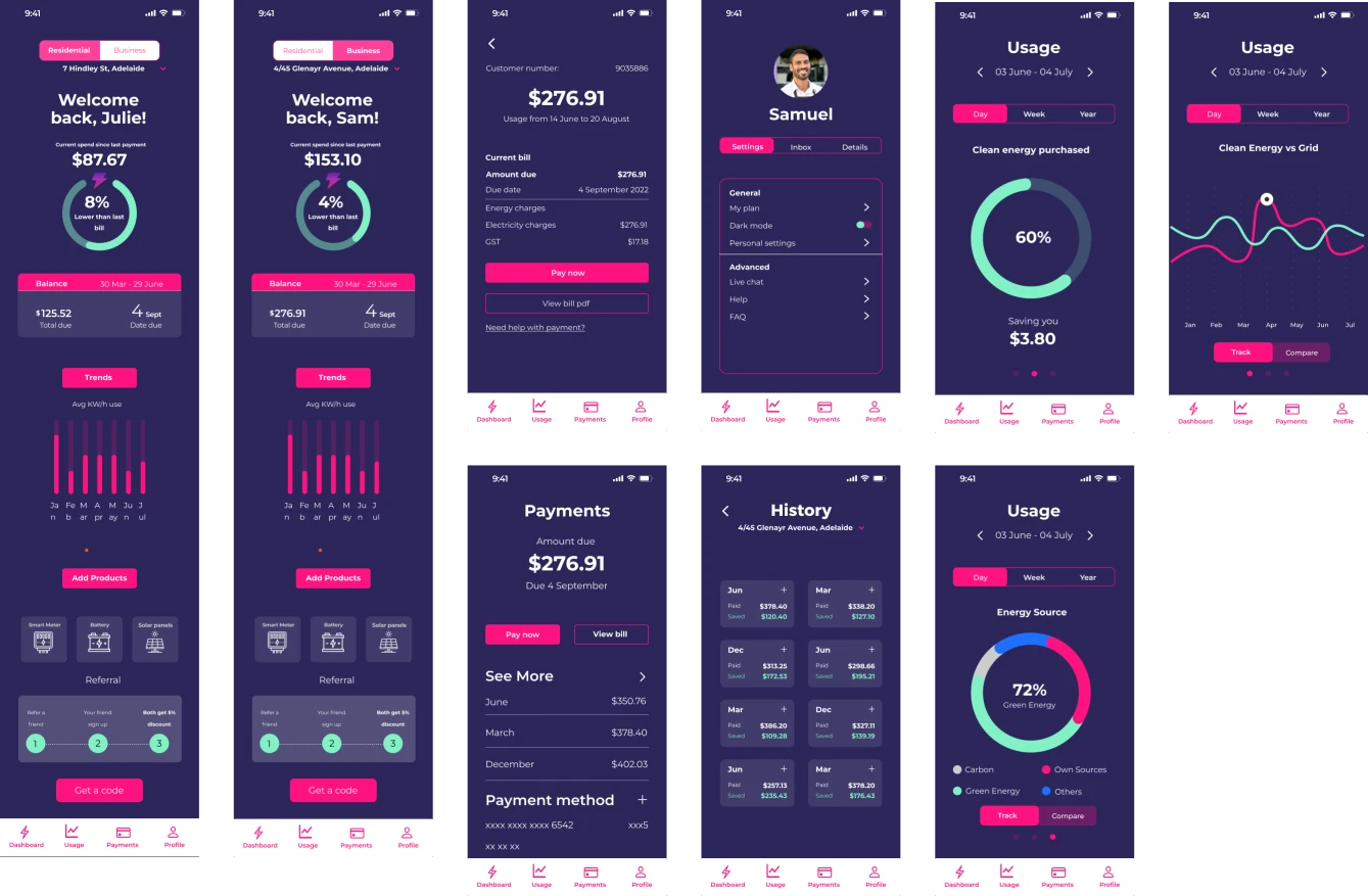
Phone App
Key Outcomes
Comparison graph is conveniently displayed on the home screen so customers know exactly how much their usage is, preventing any future bill scares
Usage history allows customers to gauge their usage and observe the source of energy (green, own sources, carbon etc).
Payment at the palm of your hands. Customers can pay their bills from the app as well as see their past billing info
Profile page is equipped with plan details, FAQ and live chat serves as the first touch point for confused customers
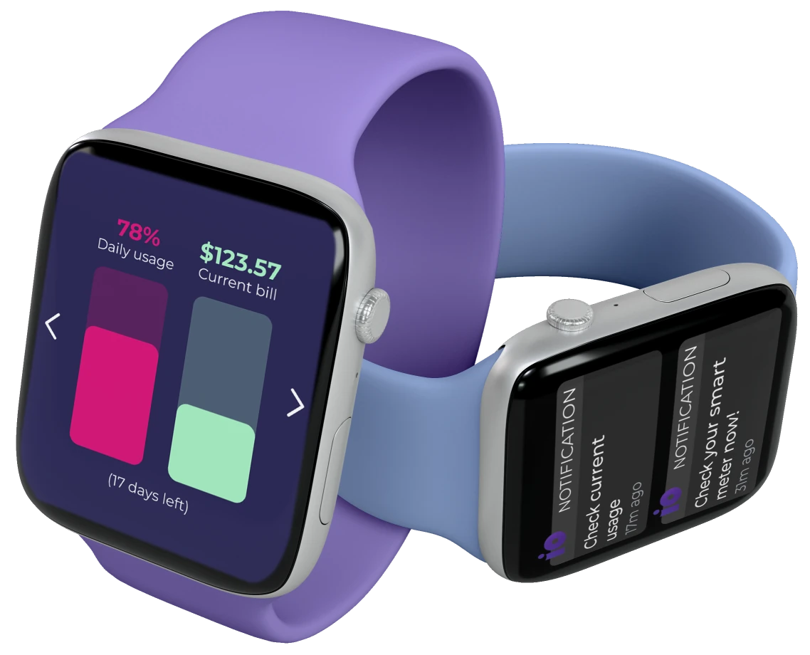
Wearable Tech
Key Outcomes
Portability for those time poor customers. They have access to the basic information such as their usage, on the go
Notifications ping the users with solar panels to capitalize on ideal moments to save energy


")
")


")
")