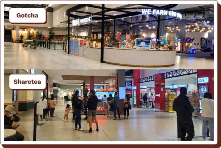
Gotcha is a bubble tea brand that prides itself on farming its own tea
Overview
Challenge
As a part of a personal project, I decided to tackle a local bubble tea store to find ways in which I could improve their foot traffic. Having chosen a store specific problem to tackle, presented its own unique set of challenges. I had to deliver a solution that was feasible within the center management and Gotcha brand restrictions.
On paper, it sounded like the franchisee of the Gotcha store had the recipe to success. They were an existing brand with a reputation, located next to the cinemas and the entrance to the apartment complex. During light chat with the owner, I had found out that they were barely getting by while their competitors downstairs were busy and I had to found out why.
I started the preliminary research by conducting an interview with the owner, to gauge his perspective as to why his business was suffering. He attributed the problems to:
Being positionally disadvantaged
Being on the unfinished floor of the complex made people unaware of the existence of his store.
With these key points in mind, I framed the problem statement as below.
If people can only find you by accident, there’s a problem, a BIG problem
The foot traffic up here is absolutely dead
Not many people funnily enough, know that we exist upstairs
What's the problem?
M-City shoppers are unaware of the existence of Gotcha upstairs. Therefore, we need to raise awareness of the store to increase foot traffic.
The Research
To scope the landscape of the bubble tea scene, I sent out an online survey to find out what pain points were plaguing bubble tea stores, and what consumer’s priorities were when choosing brands. The surveys were submitted to Facebook groups and various forums, totaling 67 responses over the course of 2 days.
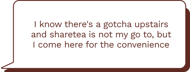
While the survey provided a general insight, I needed store specific data. Referencing the survey insights, I tailored a set of questions to use in guerilla and one on one interviews, with shoppers at M-City. I managed to conduct 7 guerilla and 5 one on one interviews. A common user behavior amongst the interviewees was that they chose their brand of drinks based on convenience.
Insights
Convenience was even more obvious amongst the results of the categorized data. Majority of the consensus, which was 37%, mentioned they would choose convenience when it came to choosing brands. This was reinforced by all 5 one on ones and 6/7 of the Guerrilla interviewees having ordered from the competitors purely out of convenience. Consumerssaw bubble tea as a supplement to whatever task they were doing and wouldn’t go out just for bubble tea.This user behaviour turned out to be their biggest pain point!
Convenience
Consumers bought from whichever brand was within vicinity and convenient. In this scenario, Gotcha’s competitors were located next to the most popular entrance to the complex*. *According to the center management via email exchanges.
Menu Accessibility & Price
Consumers were overwhelmed by the menu, and felt they couldn’t explore options outside of their comfort. With 78% of them being Uni students, they considered bubble tea a luxury.
The Pivot
The research, helped me reframe the problem statement to:
Bridge the inconvenience of ordering from Gotcha, while making the menu accessible so they can make an informed decision
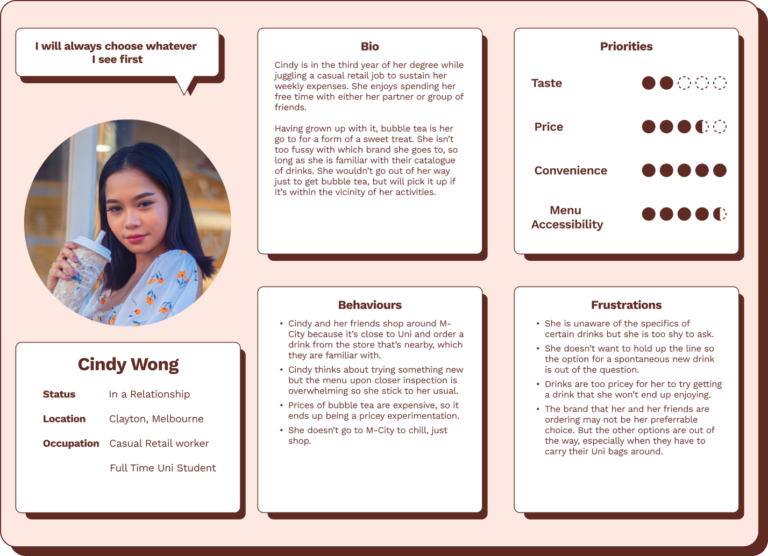
The Persona
All this data gave birth to my Persona, Cindy. She’s a Uni student whose Uni and residence is within close proximity of M-City. She only ever hops into M-City to do some quick shopping as it’s the most convenient location. Most of her decisions are made to satisfy convenience or possibly laziness.
02 Define
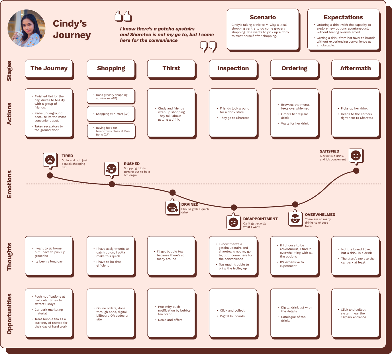
Customer Journey Map
Cindy’s journey paints the typical behaviour and thought process of the insights gained from the interviews. It shows that she avoids the pain point of inconvenience for the sake of convenience, only to be confronted by other paint points.
Workshop & How Might We?
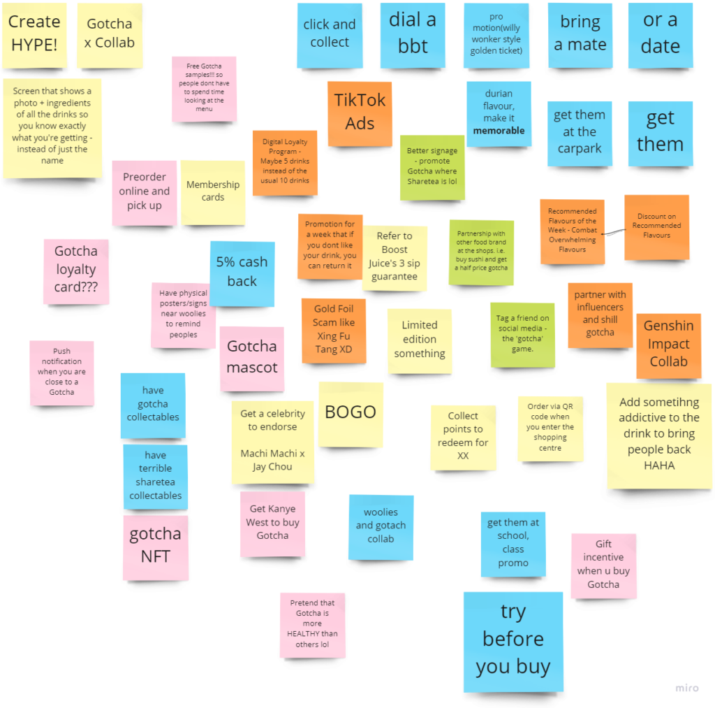
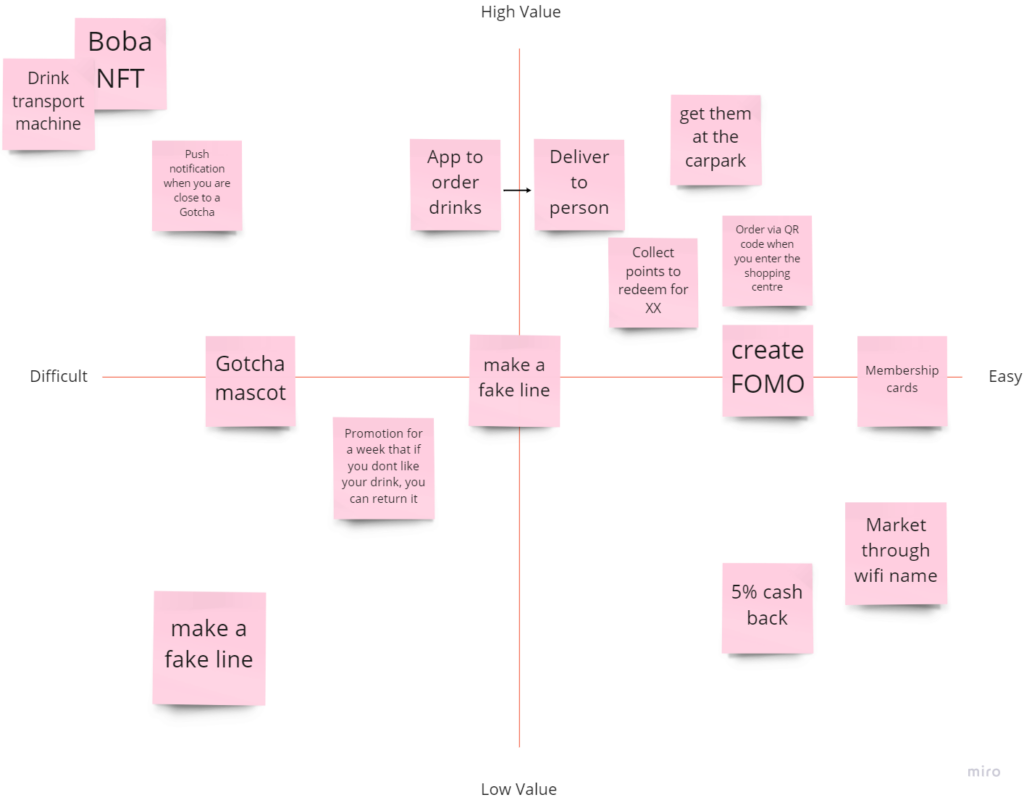
Through email exchanges with the center management and Gotcha marketing teams, there were a set of restrictions I had to follow. Keeping this in mind, I went into the workshop with the statement, “How might we make it more convenient for customers to get drinks from upstairs?” I chose to tackle convenience, as this was a mutual pain point between the business and Cindy. I facilitated a workshop to generate ideas, and because the problem was store specific, I made sure the participants were acquainted with the circumstances surrounding the store. The workshop produced a myriad of ideas, and together as a group we distributed the top ideas into the MVP matrix.
Storyboard
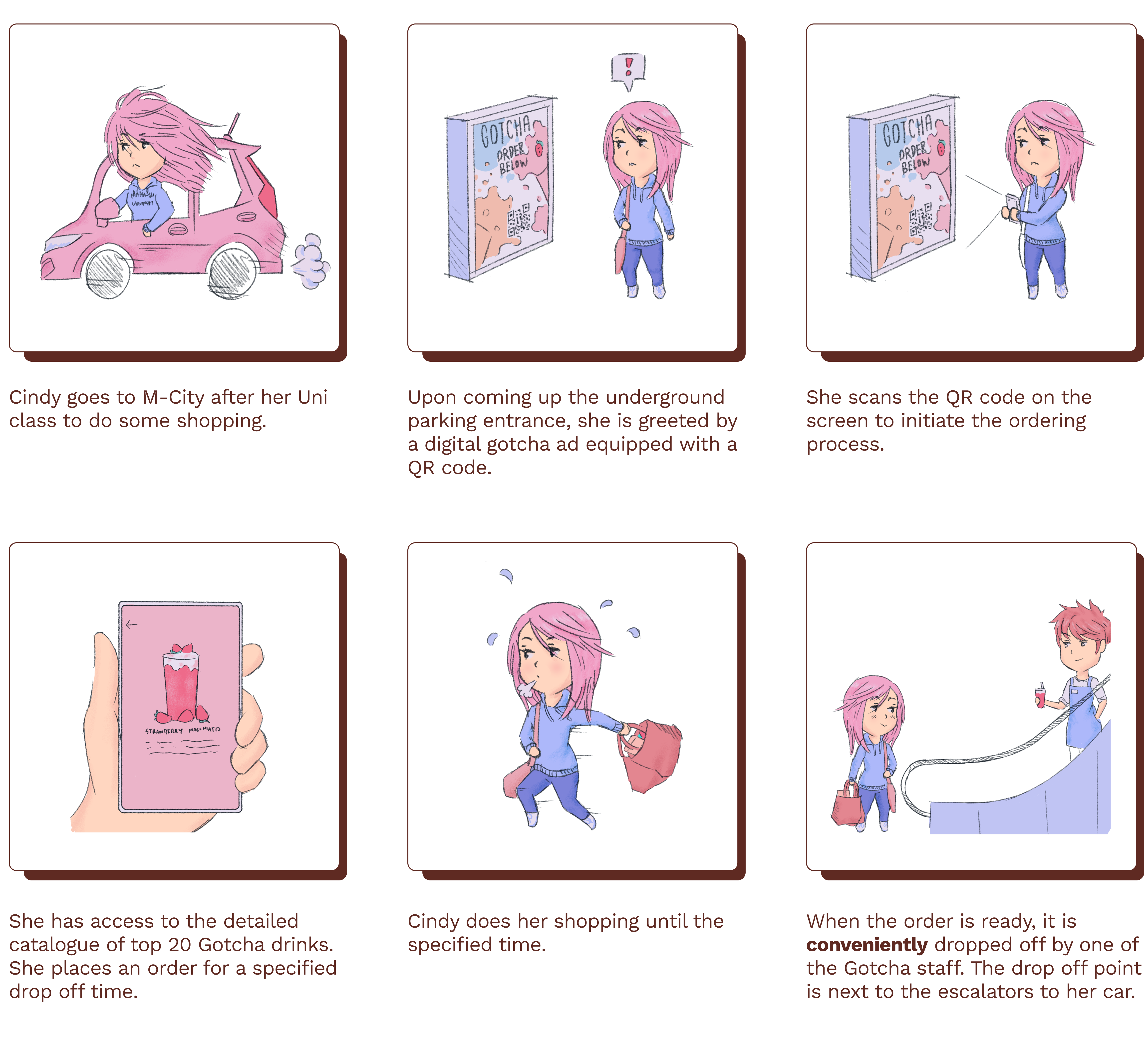
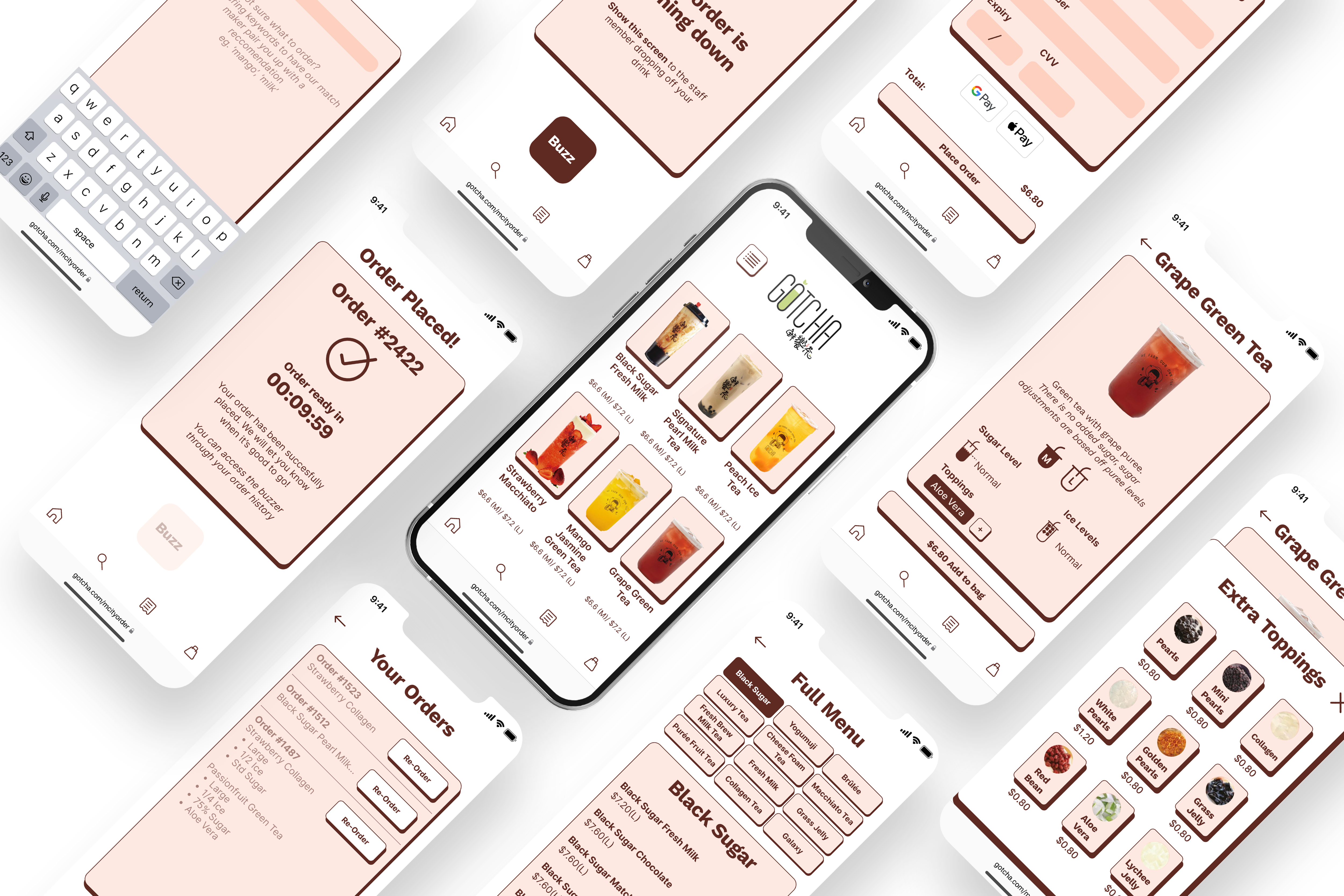
I used a combination of the generated ideas, but referenced a reoccurring joking suggestion that was made by Cindys, which was to have the store relocated. I obviously couldn’t bring the store to them, but I could definitely bring drinks to them. So with that I decided to create an app to let Cindy’s order drinks and have it conveniently dropped off at the bottom of the escalators, right next to their car park entrance.
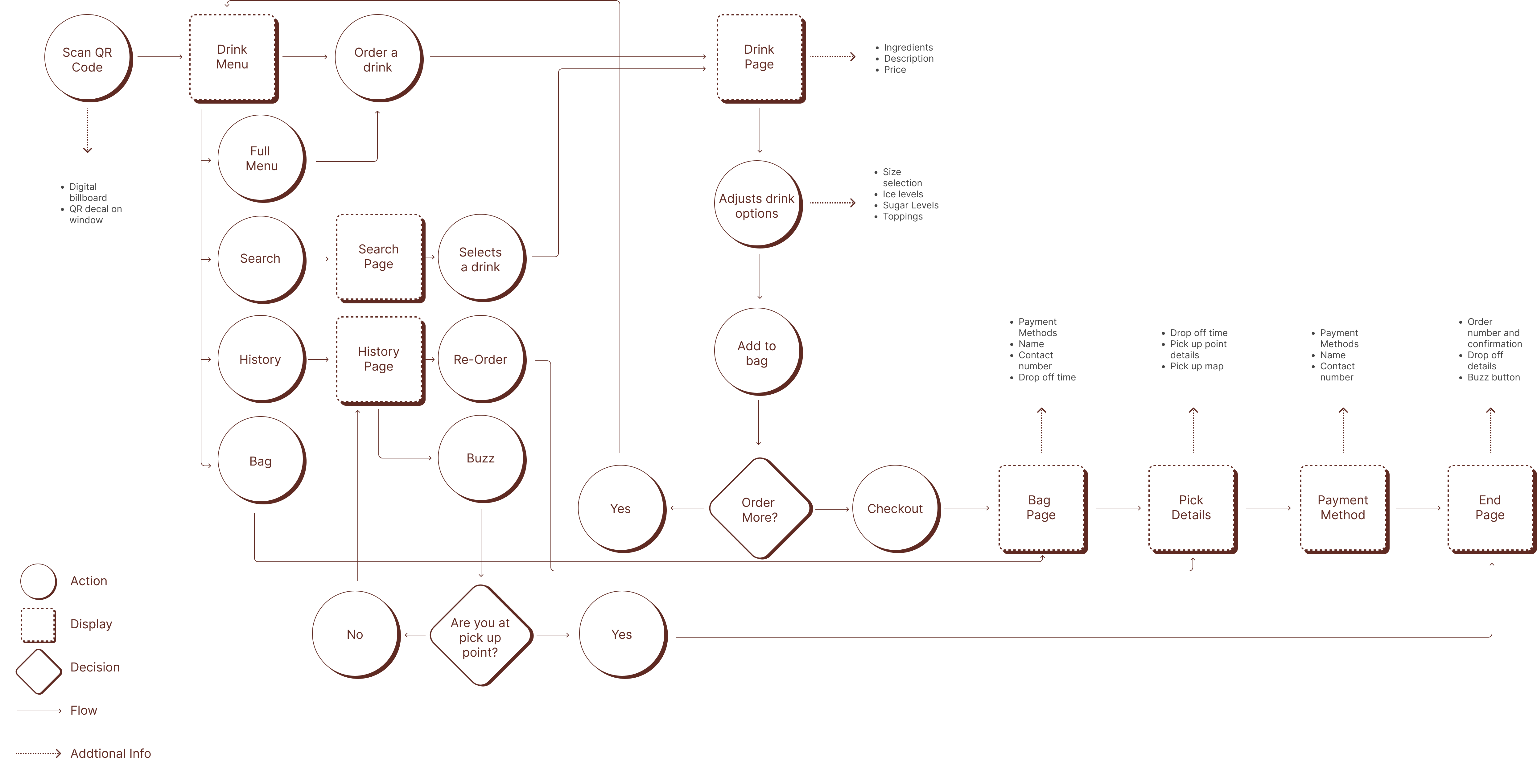
User Flow
User Flow
03 Develop
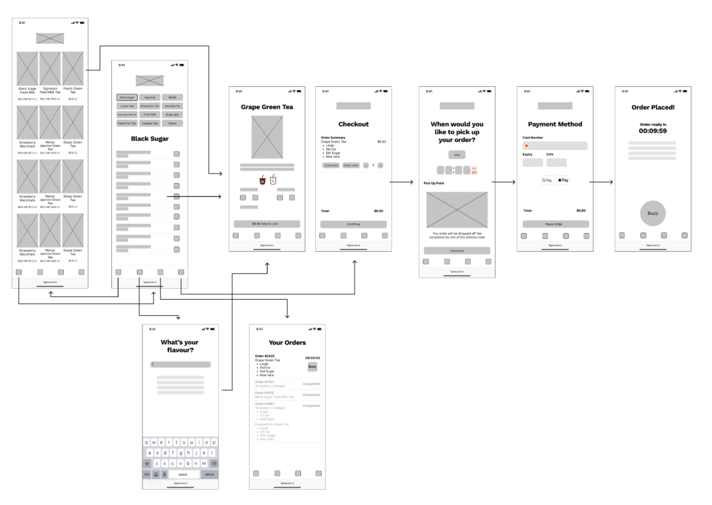
Wireframing
I repeated the process of implementing requested features and testing, but the key themes I had in mind while iterating were:
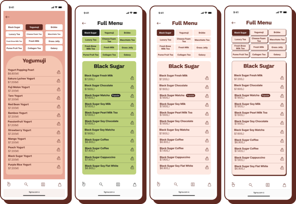
Adhere to the brand marketing. I used the existing list of top 20 drinks for the homepage, so there is no bias of curation of drinks.
Convenience. Cindy’s prioritize convenience above all else, I have to make sure the solution easier than or the same as ordering from the competitors physically.
Speed. Cindy’s are time poor, so getting from A to B has to be efficient.
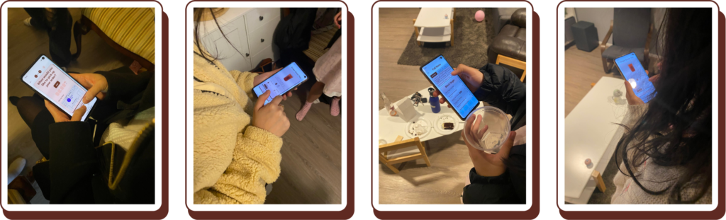
User Testing
When it came to testing the initial wireframes, I was immediately given a reality check. 5/5 Cindys rejected the idea of having to download an app, mentioning it would faster to order from the competitors. My solution to that problem was to pivot towards a web app, as it provided them with the fastest access. It did not require them to register, sign in or download any apps.
The first iteration took them an average of 29 seconds to find and order a drink. Through feedback, I added a search option, and combined the contact details with payment methods, cutting down the time to an average of 20 seconds. As an incentive for them to reuse this system, I added an option to reorder from history cutting down the time even further, to roughly 10 seconds.
If I already know what drink I want, I don’t want to scroll through to find it.
If I use it again, do I have to look for the same drink again?
You should add a search option
UI
Keeping with the brand’s identity, I experimented using colours from the brand’s existing menu. The UI went through several iteration based on the feedback received:
Buttons don’t look pressable
Colours look dull. Even though they are the menu’s colours, they don’t translate well to digital.
There isn’t enough contrast making the text illegible.
Didn’t know of the existence of some buttons.
04 Prototype
Key Features
Timed Ordering: Specify a time to have your drink made, so you can instantly grab your drink after shopping is done.
Buzz & Drop: When your order is ready, simply buzz the Gotcha staff upstairs to let them know you are at the pick up point, and they will bring your drink down to you.
Search: Use this for more than just a name search. You will be recommended drinks based on what ingredient or flavour you type in.
Functioning Prototype
Take the prototype for a spin! Hit the R key (only available on computers) to restart the prototype.
Next Steps
Redefine the onboarding process. I would like to explore an option where cards with the QR code are given out at the carpark entrance, given the entrance is just before the competitors, it will give Gotcha a tactical advantage.
Real life implementation of web app to test the functionality and accessibility.